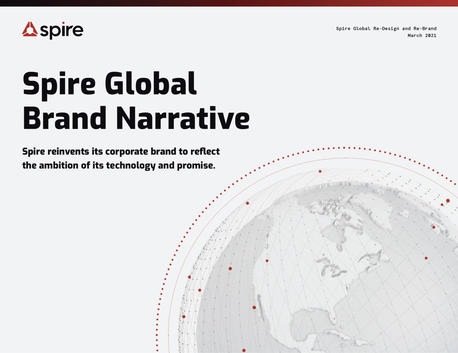
Spire Global Brand Narrative
Spire reinvents its corporate brand to reflect the ambition of its technology and promise.
View the PDF version
The challenge for creating a new brand and design for Spire was how to create a “last name” umbrella corporate brand for a company with lots of “first” names—six autonomous start-ups—all of which had to tie in visually and meaningfully to that net-new corporate brand.
Two years ago, Spire decided to focus at the bottom of the sales funnel and work its way up, which led to a demand generation, pipeline-driven design. This new website represents expanding that lead-generation engine. It optimizes for design, content, and accessibility of Spire’s technology for customers first, both current and future. Then press and media, employees (current and prospective), investors, regulators, and political and NGO leaders. This re-design represents Spire’s top-of-funnel arrival, as we now dedicate full resources to our corporate brand, communications, and public awareness.
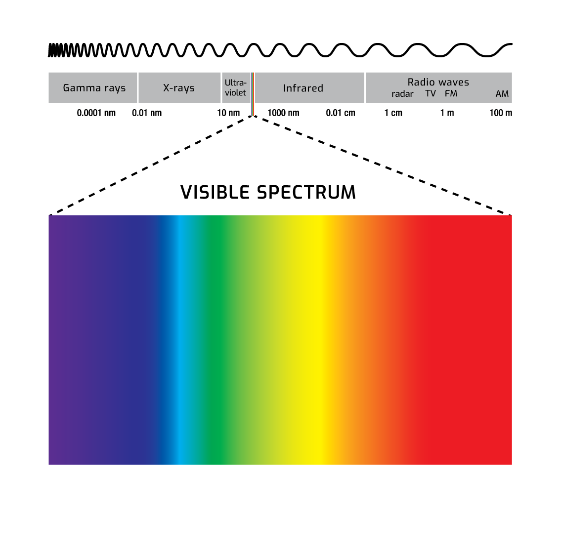
The inspiration behind this corporate Spire design is not so much about what you see with your eye (‘pictures’). It’s about what you don’t see (‘RF waves’). Since Spire is a space-powered data company that generates actionable insights about tough challenges on Earth, we started iterating based on the core fundamental science behind our technologies, the electromagnetic spectrum.
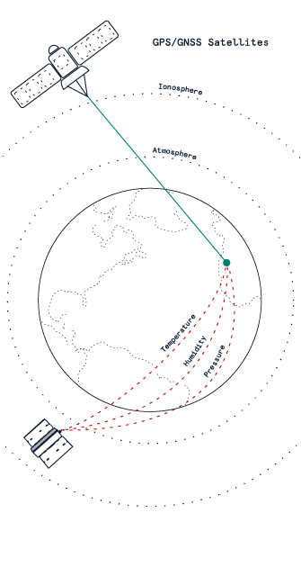
Radio occultation: A remote sensing technique used routinely to enhance weather forecasts on Earth to measure atmosphere’s temperature, pressure, and humidity.
Part of Spire’s “secret sauce” is something called radio occultation, where our CubeSats in low-Earth orbit capture radio waves off of GNSS satellites (e.g. GPS and GALILEO satellites) in order to measure our atmosphere’s temperature, humidity, and pressure with unprecedented global frequency.
Black and white are the only components needed to create natural space (i.e., light/no light) but can ALSO represent the binary components needed for digital space (i.e., on/off, 1/0), and RED is the “visible gateway” to the invisible radio frequencies. Meaning it’s the last frequency the human eye sees as we move along the electromagnetic spectrum to reach invisible radio frequencies.
Hence we settled on a pure corporate Spire “gateway” red. As we continued to research other new space companies and how they represent the Earth, we found a lot of darkness.
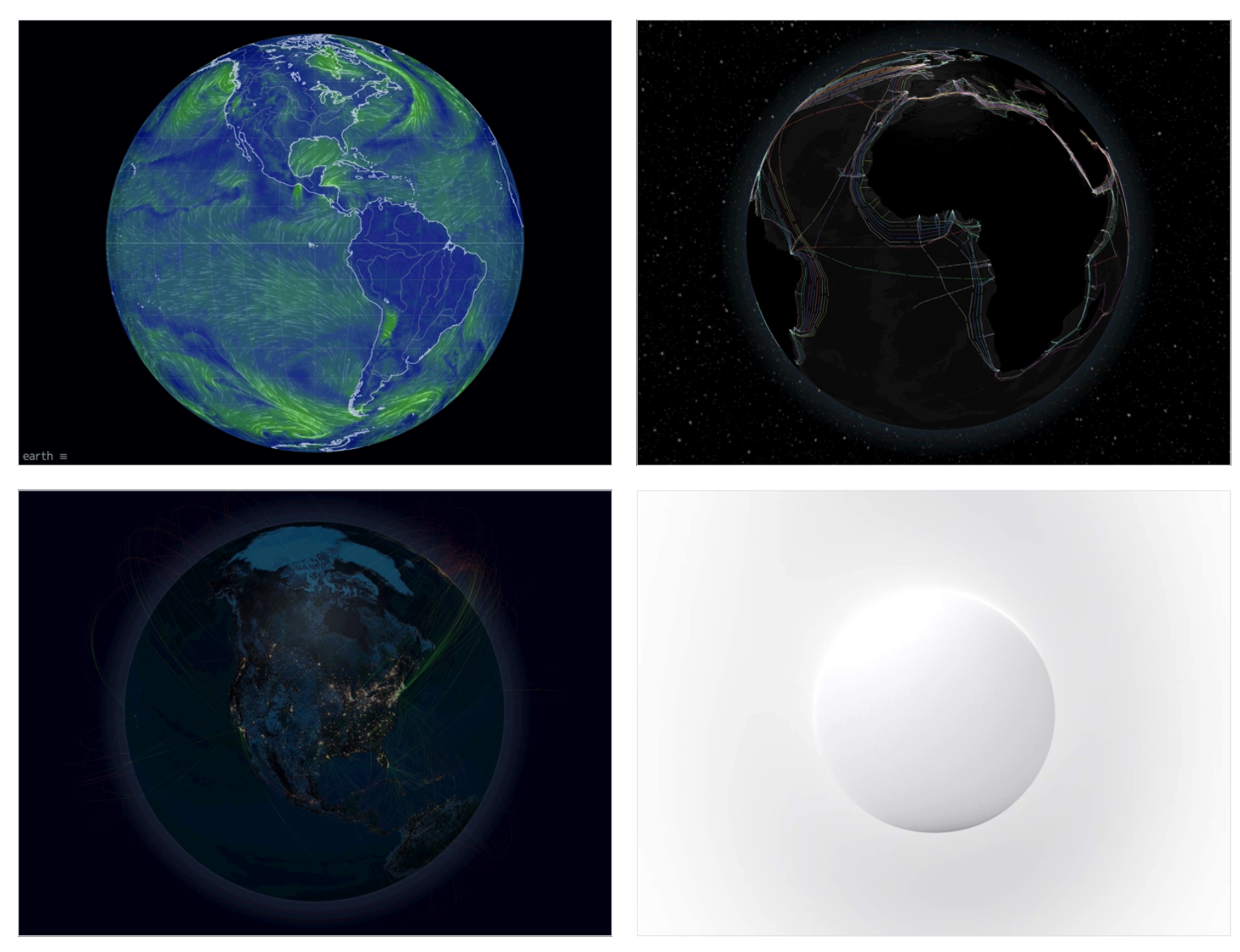
A comparison of typical branding in the industry and our initial “white on white” concept.

Outlaw, Studio Uwe Loesch, 2002
What if we found a clean, simple way to translate the boldness of our technology and differentiate our brand in a space that is dominated by foreboding darkness? What if we launched a space brand with “white on white”, to reflect our highly differentiated technology and the ambition of our solutions? As we did more research on these colors, red and white, we found this image, which resonated on several levels.
We found this image on the right: a white background, the hard lines that ground a technology company in hardware and software, the simple, elegant, minimal red favicon, evocative of a good European brand, Swiss Air, and reflected the large European presence of the company, with major offices in Glasgow and Luxembourg. These elements, combined with an almost spiritual, direction-driven aspect of ravens, which are considered to be messengers of prophecy and prediction, completed a picture of where we thought we should go.
We ended up creating a color palette that is based on red, black, and white, with white being the predominant color, and because Spire creates data about Earth from our nanosatellites in space, we needed to create an animated ‘digital twin’ Earth for the corporate brand. Because each of the autonomous business units (Maritime, Weather, Aviation, Federal and Space Services, and Earth Intelligence) needed its own color treatment, we went back to the electromagnetic spectrum and created a gradient for each business unit that tied back into the larger corporate identity, and gave each of the business units logos that are each unique but evoke the larger corporate brand identity.
Each business unit logo got its own gradient favicon that is semantically tied to its business value proposition but with a corporate Spire red wordmark. We adopted the “Branded-House” or “FedEx” model to create a master ‘last name” corporate identity, along with sub-brands that tie into the parent company.
For the main corporate Spire wordmark, we wanted to evolve it from a serif’d old-school typeface to a more forward-looking and bold sans-serif typeface, where the “r” played off of an “orbital e” to show the interconnectedness of our data and the Earth. As Spire builds, owns and operates the largest multi-purpose constellation of nanosatellites, the value of our solutions is in the data that comes from the “ultimate vantage point”, space, which is reflected in the simple red dot over the “i”. The dot optically sits “over” the word “Spire” and reflects Spire’s ultimate offering of competitive advantage, data gathered from Space. The red dot also becomes a beacon of sorts, for businesses wanting to have a competitive advantage, and for the Earth itself, as the receivers on many of Spire’s satellites demonstrably help mitigate global climate change, and help predict big weather events in an effort to save lives.
With this design ecosystem, our team was able to solve for the unique corporate organizational structure of the business, and launch a brand as big and bold and differentiated as the very technology that grounds the business. The ambition of the design matches the ambition of the company, to create multiple businesses around Spire satellites, and to help solve some of humanity’s and the Earth’s toughest challenges.
So, again, the magic to this design is not so much in what you see, as what you don’t see.
The 21st century should be very much about humanity’s collective ability to surpass one human’s singular ability. For example, more data is being collected than humans can process, rockets are landing from space that no human would be able to land manually, and eventually Mars voyages will be packed with technologies that humans wouldn’t be able to do themselves. Our design is based on this type of idea: the existence of our universe looks nothing like what the human eye can see, because we see so little of it. There is so much there and yet it is invisible to us. Hence, we are launching a space company grounded in the concept of white on white, with red as the gateway color frequency into a world that surpasses human ability, and optimistically looks to a future thriving world of sustainable abundance.
This is a design that reflects the company vision where insights and information from the ultimate vantage point–space–about our current world, can help us build a better one, by placing previously unavailable knowledge about Earth into the hands of decision-makers so they can lead, act and plan with confidence. With these colors, typography, digital twin design concept that includes a globe encased in red dots, you can visually see how Spire uses data about every point on Earth to help solve our global challenges.